
CAN YOU CHANGE A BRAND WITHOUT LOOSING CUSTOMERS? AND HOW? how much?
I often hear this: I can't change the colors and fonts - especially the logo! - that means loosing customers! They wouldn't recognize my company anymore! I'd lose everything I've built so hard. One said: "Even Nike doesn't ever change their logo". Is this true?
The thing is, colors and fonts get old-fashioned quickly. All visualization does. You can't avoid it and do nothing.
So how can you avoid losing customers? How should this be done?
You have two options:
1. You change all at once and make a thing of it (campaign & marketing)
2. You make moderate changes that might not be noticed by others but they make the brand look modern again and avoid the old-fashion look. THAT will be noticeable soon.
Which one to choose?
1. Change all at once
Usually, if your target groups are bigger, (often a bigger company), you can afford to change all. But you must think about it carefully. especially the parts that communicate a meaning (like a logo shape). This can go wrong (I've posted about Jaguar link in comments and Tropical is another example).
Marimekko you can argue for or against. This also depends on if you want to change the target group or launch a new business line and separate it from the rest.
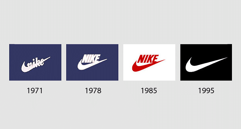
Nike’s logo history
2. Make small (almost unrecognizable) changes
Even if the big change would be a good option, you might not have the recourses to make a big campaign nor reach your target group easily. In that case, I'd stick to the main parts of the brands.
Big companies often avoid the first one too especially if the brand is well-known.
When I say almost unrecognizable I mean the changes that most of us would not notice at all. The very small number of people that do would see it as positive and moving forwards. And what’s good, it’ll be a thing to draw the attention.
If you look at Nike or Coke, you might think they've had the sama logo always. That's not true, they've changed it all along the way using moderate changes and new, similar logos that are recognizable that despite small changes. we adapt visuals quickly and soon nobody remembers the old ones at all.
Coke has also always advertized the drink as part of a lifestyle.
Tropical tried to change some amount of the visuals. Unfortunately they changed parts that communicated the main thing: freshly squeezed juice.
So you have to be careful with the things that people associate with the logo, colors and shapes.
How to do number 2.
Look at the parts of you current visualization, like fonts and colors.
Look at competitors.
Look at color trends.
Think what you consider modern.
Consider color theory and psychology: what colors best suite together and what people usually associate with certain colors. There can be exceptions. Use AI. I also have tool for this, link in the comments.
Some this year’s trend you can find in the other blog posts.
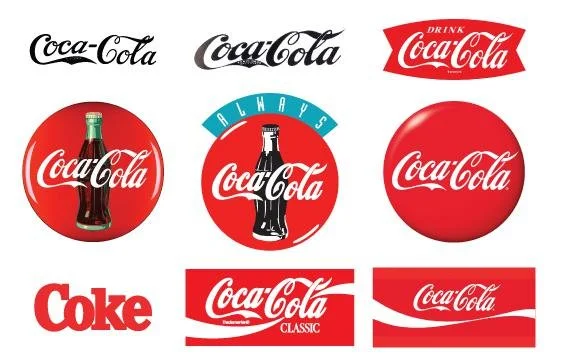
Coke’s logo and visual history -
Red color is the one we see first. It has a lot of meanings like danger and on the other hand, love.
Colors stick to our mind subconsciously and that’s why they are so important marketing tools.
read more about colors (in Finnish) or order a color evaluation.
Updating colors
You can update he current colors e.g. using different shades of it, maybe changing one color. Logo is included, ask people if it looks old-fashioned. Update anyway all old signs if you must look fresh. The logo can be moderated just little and it's modern again. Big titles and clear fonts are in now, brighter colors too. Green, orange, brown are in. It might be a brighter shade or your colors. If you are not sure, you can use AI, take a picture and much software will give you the colors on, learn more and/or use a professional. (VisuOpisto a course about this using my own color theory in practice, link in comments). People don't recognize small changes but subcutaneously consider it modern and the changed will give an impression of a company moving forward.
Conclusion
Whichever you choose, it requires some thinking behind and a good plan how to do it. Again, AI is a good tool but can't be trusted alone.
